The advertised salary of analysts in nonprofits is increasing at nearly 20% a year, and other surprising facts

Ben Proctor, Innovation Director

Hannah Khwaja, Data Analyst
For a little over a year now I’ve been publishing a (mostly) weekly newsletter listing data related vacancies in nonprofits that I have come across. This is mainly intended to raise the profile of the data profession in nonprofits, but I have heard that people have found it useful for jobhunting and for understanding the market.
Six months ago, I wrote a blog covering some of the stories that I had found in the data. With a full twelve months of data under my belt it seemed sensible to do the same thing.
For this analysis I had the support of my colleague Hannah, who undertook the analysis and produced the charts, leaving me to simply write a few words and take the credit.
There is one point it’s worth stressing. Some vacancies are advertised with a range of salaries “from £27,000 - £29,500”, some are advertised at a single salary “£30,000” and some are advertised with the maximum salary “up to £45,000 for an exceptional candidate”. For this analysis we have to assign a single salary figure to each vacancy. Where there is a range of salaries we assign the figure from the top of the range.
There is an argument that we could have used the middle of the salary range but because for some vacancies we only have the maximum figure we decided using the top of the range would be most consistent.
We’ve put a detailed description of how we processed the data at the end. I’d read it first but I accept that many of you may just want to get to the findings.
There are a lot of analyst vacancies
There were a total of 563 vacancies in our dataset. Analyst was the most commonly occurring role (occurred 107 times), closely followed by Manager (90 times) and Officer (85 times).
The median advertised salary for an Analyst was £36,800, for a Manager £42,000, and for an Officer £28,000.
At the bottom end of the salary range in terms of median salary are Assistant (£25,600), Coordinator (£26,400) and Administrator (£26,700).
The roles with the highest median salaries were Director (£86,000), Associate Director (£66,100) and Senior Engineer (£62,500).

Showing only job types with at least five vacancies in the dataset
Salary ranges for different job types
Median salaries are all very well, but what is perhaps even more interesting is to understand the range of salaries.
We looked at interquartile range which is worth a little explanation.
The lowest quartile is the salary where 25% of jobs would be paid less and 75% would be paid more. The highest quartile is the salary where 25% of jobs would be paid more and 75% would be paid less.
Looking at the range from the lowest quartile to the highest quartile shows you the middle range of salaries; 25% of jobs are paid more, and 25% are paid less, but 50% of jobs are within that range.
This is the interquartile range.

Showing only job types with at least five vacancies in the dataset
The narrowest ranges were mostly seen for lower-paid roles, with the smallest ranges seen for Assistants (£24,600 to £27,300) and Coordinators (£24,700 to £28,400).
There was considerable overlap between the salary ranges of many roles, particularly Managers, Developers, Leads, Specialists, Senior Analysts and Engineers.
The job type with by far the broadest salary range was Director (£67,500 to £120,000). I’m the Innovation Director. I may need to have a conversation with my employers.
Are bigger organisations paying more than smaller ones?
This was a question I was excited to find the answer to. My prior is that larger organisations will pay more. But now we have data. We think about size purely in terms of annual income and use the NCVO classification of Micro to Super-Major:
Micro: Less than £10,000
Small: £10,000 to £100,000
Medium: £100,000 to £1m
Large: £1m to £10m
Major: £10m to £100m
Super-Major: More than £100m
The answer is, broadly speaking, yes. Larger organisations do offer larger salaries.

Analysts and Managers do get offered higher salaries in larger organisations.
There were three vacancies for Officers in Micro or Small organisations which were offered on unusually high salaries. Discounting these, Officers also get offered higher salaries in larger organisations.
Potentially this is an additional challenge for smaller nonprofits. Not only do they have to compete with other sectors on salary but also with other nonprofits.
It’s interesting that there were no vacancies for Analysts in Micro or Small organisations, even though Analysts are the most commonly occurring vacancies in our data.
Are salaries changing over time?
This is a burning question. Inflation in general is running high, but can we see that in just 12 months of data?
Yes we can. Especially dramatically for Analysts.
We looked at the three most commonly advertised job types.
The median advertised salary for an Officer in Jun-Aug 22 in our dataset was £28K. In Mar-May 23, it had become £29.5K (though it dipped in between). So between the first and final quarter the median advertised salary had increased by £1.5K a 5% increase. That time period represents three whole quarters so that represents an increase of around 7% per year.
Across the same period, the median salary for Analysts grew from £34.5K to £39.3K – a 14% increase. This roughly represents an annualised rate of 19%.
The median salary for Managers was £41K in the first quarter and £45.8K in the final quarter – a 12% increase, which represents a roughly annualised rate of 16%.
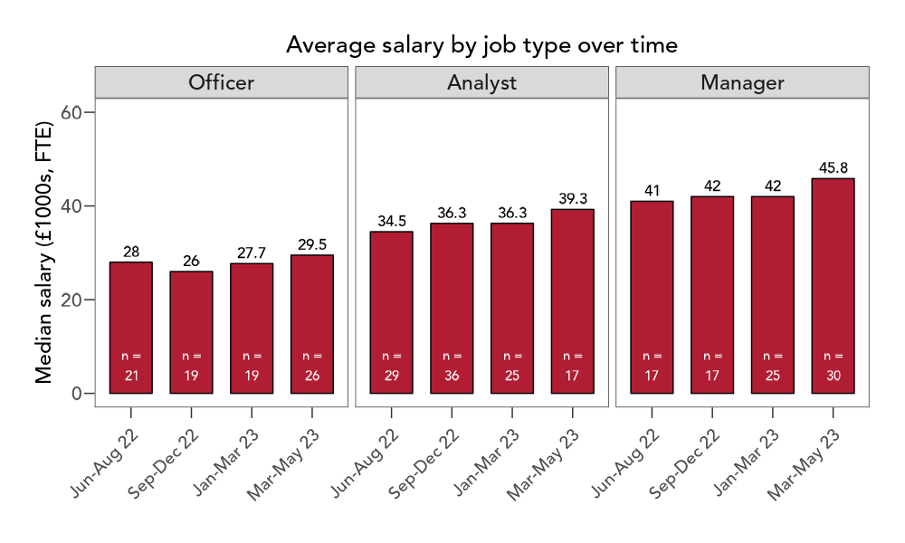
It’s worth bearing in mind that these are the advertised salaries. Increases here don’t mean that the average analyst is being paid a lot more. But it does suggest that people in all of these roles could increase their salary if they moved. They might at least start looking.
One clue as to what’s driving this inflation comes from looking at repeat vacancies.
31 roles appear in our dataset multiple times more than 30 days apart, suggesting possible difficulties in recruiting. In 13 cases (42%), the roles were readvertised with a higher salary (median increase: £3,000).
This is a small signal because there were 563 vacancies in our dataset. So possible readvertisements only represent 6% of all the vacancies we looked at. It does hint that the recruitment market might be tight, at least in some areas.
How do nonprofit salaries compare to the wider market?
We often hear people say that nonprofits can’t offer the same salaries as other sectors. We wanted to investigate this. Indeed.com is a large job board and they publish the average pay for a range of roles advertised on their platform. We compared their data to ours for a number of roles.

In this comparison nonprofits advertise Data Scientist and Data Engineer roles notably below the UK average. Nonprofits also advertise Coordinator, Analyst and Senior Analyst roles slightly below the UK average. On the other hand, Administrator, Manager and Specialist roles are advertised above the UK average.
This is only one comparison and we don’t know too much about any biases there might be in the types of organisations advertising on Indeed.com. This does add some weight to the idea that nonprofits are offering lower salaries for key data roles than are available in other sectors.
How does taking a Data Maturity Assessment affect recruitment?
It may not have escaped your notice that at Data Orchard CIC we are, how shall we put this?, keen on data maturity. Data maturity is simply the idea that there is a journey that organisations can follow to get better at how they use data and analytics.
We have a Data Maturity Assessment tool that allows organisations to assess their current level of data maturity. This can help in developing plans to improve data and analysis in the future.
We would expect that organisations that take a data maturity assessment might be more likely to recruit data staff because they have shown an interest in investing in this area. We also know from other work that taking a data maturity assessment often leads to increased investment in data roles.
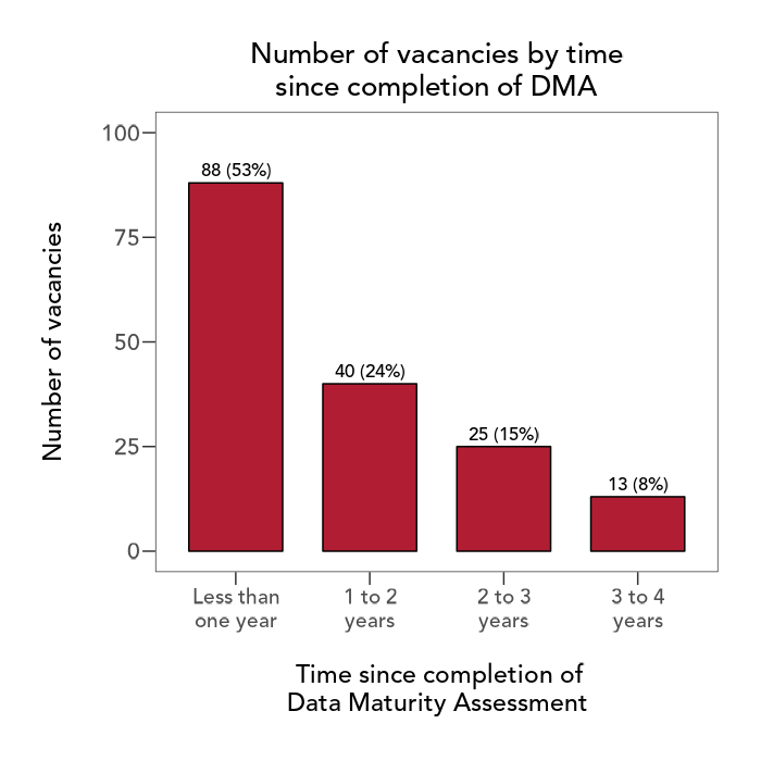
Our analysis seems to support that expectation. Organisations that have taken a data maturity assessment seem to recruit more data roles than organisations that have not.
The adverts in our dataset came from 328 organisations. 48 of these (15%) have completed a Data Orchard Data Maturity Assessment.
The total number of adverts was 563. 168 of these (30%) came from organisations that have completed our Data Maturity Assessment.
Organisations in our dataset that have completed our Data Maturity Assessment therefore recruited more roles on average between June 2022-23 (3.5) compared with those that have not (1.4).
Among the roles advertised by organisations who had completed our Data Maturity Assessment we found that around two-thirds (65%) were from organisations who had taken our Data Maturity Assessment within the last two years.
This doesn’t mean that taking a Data Maturity Assessment causes an organisation to recruit to data roles. I think it is more likely that organisations take a DMA because they are interested in improving how they use data and analytics. Part of that improvement journey is, in many cases, going to involve recruiting data professionals to specific roles.
We also know from our research that organisations that are more data mature really do see greater benefits compared to less data mature organisations.
Overall
With 12 months data under our belts, we are able to tell some interesting stories from the data.
The inflation in advertised salaries and the fact that larger organisations seem to pay higher salaries than smaller ones is an important finding for the leader of any nonprofit organisation.
The fact that Analyst is the most commonly recruited data role and that there is significant inflation in the advertised salary for analysts suggests that there may be a shortage of people with these skills willing and able to work for nonprofits. This is something that individual leaders might want to ponder, but I think it is also a sector-wide issue.
Anecdotally, we have heard that there are plenty of suitable candidates for more junior roles, but a shortage of candidates with enough work experience to make them good analysts within nonprofits. How might we, as a sector, make the sector more attractive to experienced candidates or rapidly build the experience of new entrants into the sector? These are questions I would be very interested in working on.
Need help recruiting skilled data people?
We can provide support with all aspects of recruitment including job descriptions, shortlisting candidates, conducting interviews and onboarding.
We also offer flexible, reliable and cost-effective access to our team of experienced data professionals to support your organisation over the long or short term, if perhaps you do not have the resources to recruit a permanent post or team.
Find out more about our Outsourced Data Team
About the dataset
I scan a range of job listings on a roughly weekly basis looking for what I consider to be data vacancies.
I capture a very small amount of data about each vacancy. The job title, the URL of the listing, the salary (including the range if appropriate) and the name of the recruiting organisation.
I don’t record whether the post is office-based, hybrid or remote. These differences might have real value for some candidates (for example people might accept a lower salary to be fully remote). Many posts advertise a salary plus benefits and I don’t capture these benefits in any way. It is possible that some candidates would accept a lower salary for some other sort of benefit.
Salary figures include London Weighting where this is offered. I always provide the FTE salary for part time posts. I do not distinguish between permanent and temporary roles.
Posts are advertised with salaries shown in different ways. A post may have a single salary figure, advertised “up to £X” or advertised within a range. This is not the same as the range of salaries shown above. For each post we take the maximum advertised salary. The range of salaries shown in this post is the range of maximum salaries advertised.
This choice has been the subject of lively debate within the team. We have considered using the mid-point of the range of salary bands (where these are given) instead of the top of the ranges. Typically someone would expect to start a new post at the bottom of the salary range so showing the top of the range might lead to inflated salary expectations. That said we do not know what point in the salary range any individual starts their role. People must, logically, progress along the salary range when they are in post. We don’t have lower salary bands for some posts. A manager wanting to use this data for benchmarking or budgeting will want to understand the top of the salary range. Overall we have settled on using the maximum advertised salary. The data should be interpreted in this regard.
I do list vacancies even if no salary is given. I do not list agency vacancies unless the agency specifies the recruiting organisation.
The figures are based on advertised vacancies. We can’t tell from this dataset whether organisations were able to recruit to these posts. We also can’t tell if candidates were able to negotiate higher salaries than advertised or where in an advertised scale a successful candidate was initially paid.
Hannah matched organisation names against public records such as the various charities regulators or companies houses. This allowed her to identify organisation size in terms of income (in the majority of cases) and to match this against our dataset of organisations that have taken a data maturity assessment.
We hope this has been of interest to you. Do sign up to be on our mailing list of interesting stuff sent out every month.